Progress Bar
Summary:
Integrating a progress bar into your funnel or website is an effective way to visually display the user's advancement through the content.
Integrating a progress bar into your funnel or website is an effective way to visually display the user's advancement through the content. With numerous customization options available on the left-hand side of the page, you can effortlessly tailor the progress bar to suit your specific design and functionality needs. In this guide, we will explore these various options to help you create a seamless and engaging experience for your customers.
General Settings
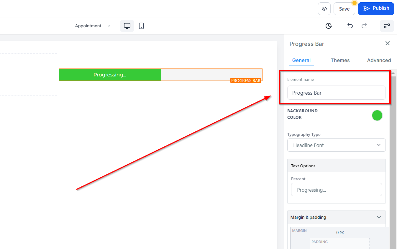
Element Name/Title
Under the General Settings section, you'll find the Element Name/Title option. This displays the default name/title of the edit option you're currently working on. You can choose to leave it as is or rename it for easier identification.
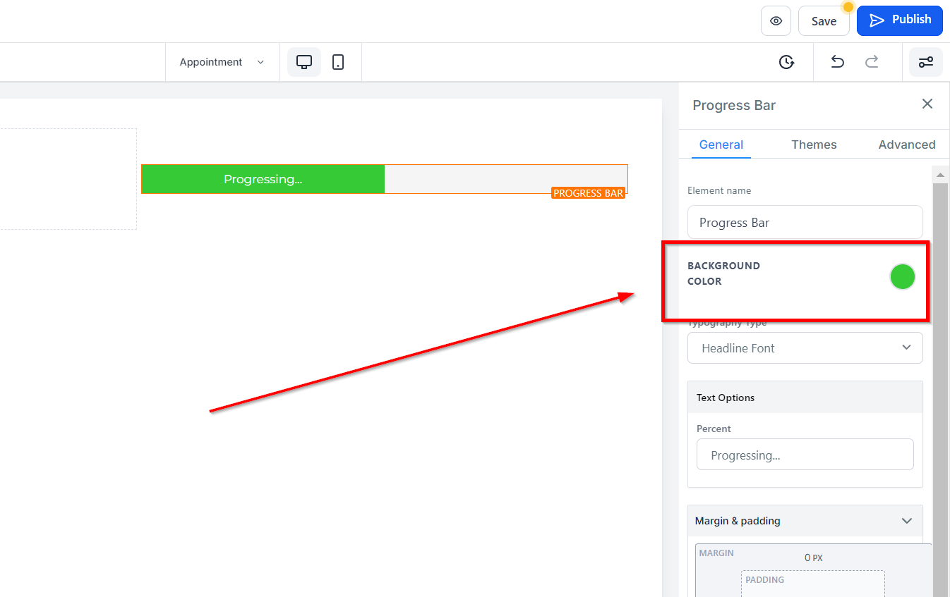
Background Color
To modify the background color of your button, select the content you wish to adjust and choose a color from the given options or input a custom color code.
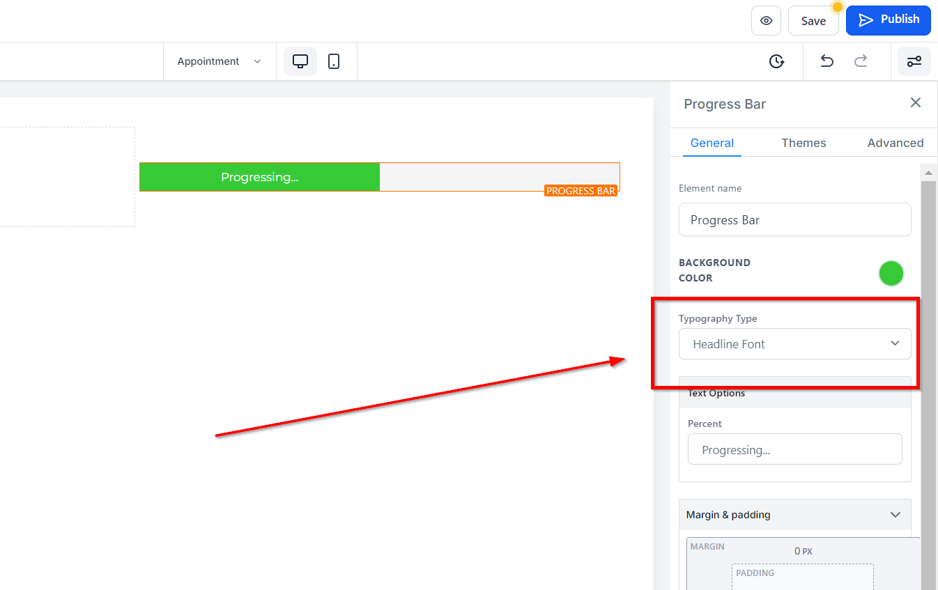
Typography Type
In the Typography Type option, you can customize the font used for your text/content. You have the choice to use the heading or content font selected in your settings, or you can opt for a custom font by selecting from the dropdown menu of font options.
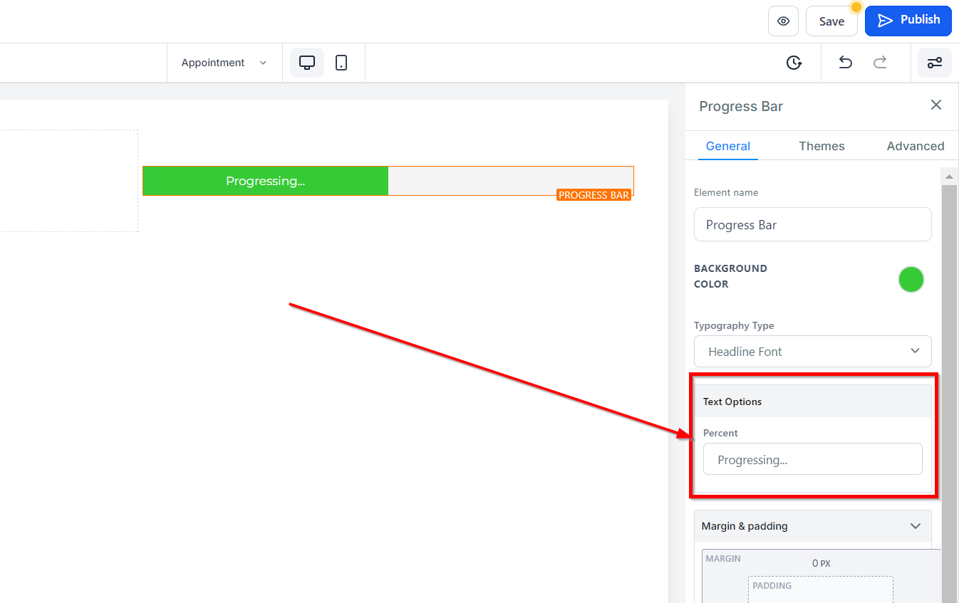
Text Options
Percent
Under the Text Options section, you can add or modify the text displayed on your button.
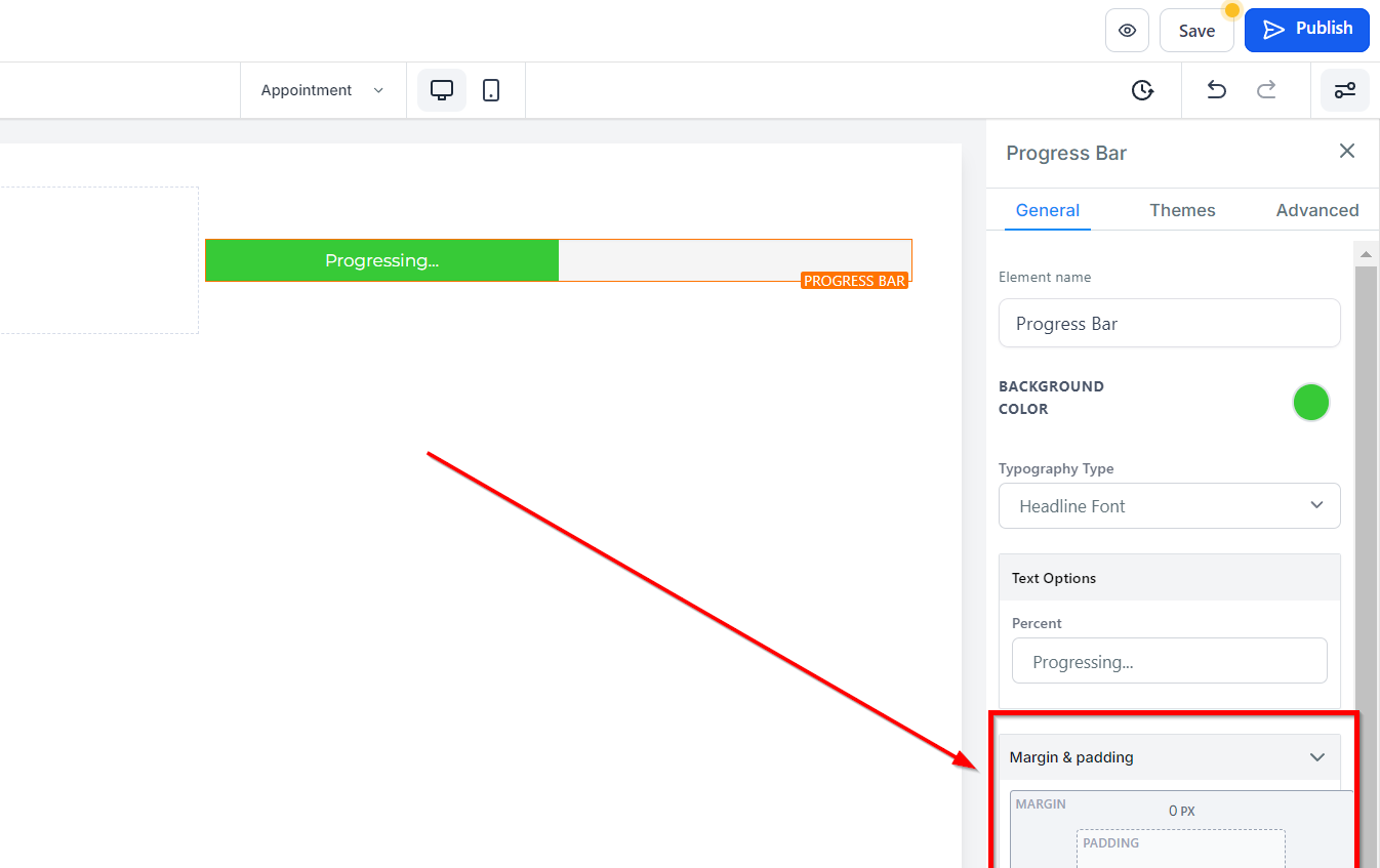
Spacing Option:
Under the Spacing Options, you can customize the top and bottom margins of your content. These settings will only be applied to the specific edit option that you are working on.
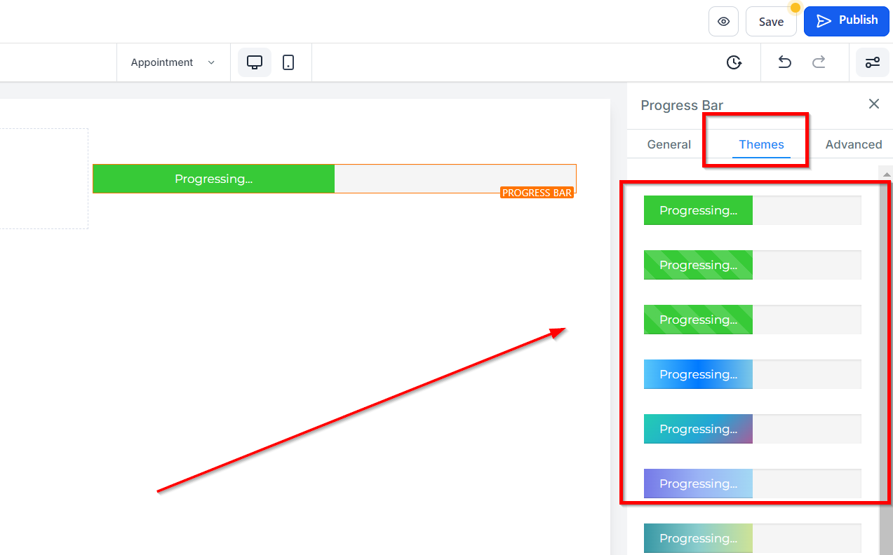
Theme
Visit the Themes tab to choose one of the available themes for your progress bar. Note that when you select a theme, the color options you choose in the previous step will be replaced with the theme colors. If you wish to undo the action after selecting a theme and would like to go back to what you had previously selected, click on the undo action button on the toolbar at the top of the builder.
Advanced Settings
Border Option:
Border Under the Advanced Settings tab, you will find the Border Option feature. Here, you can decide what type of borderline you want by selecting any option besides No Border, which will drop down more border styling options.
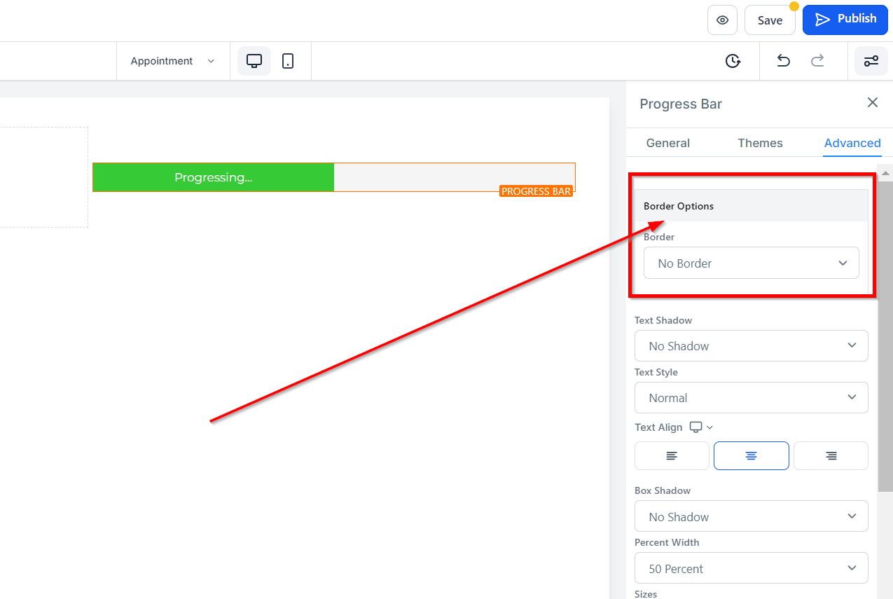
Style Select the type of borderline style you want. You can choose from Solid, Dashed, or Dotted.
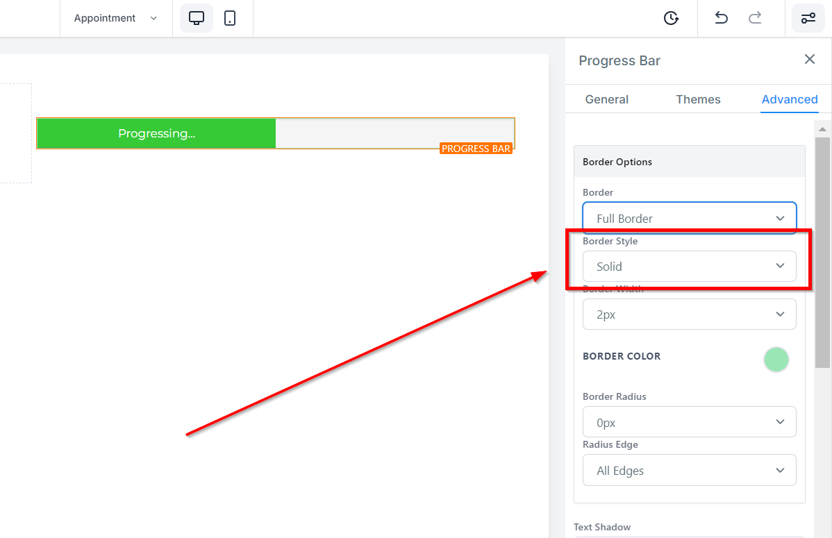
Width Click here to select how thick you want the borderline to be.
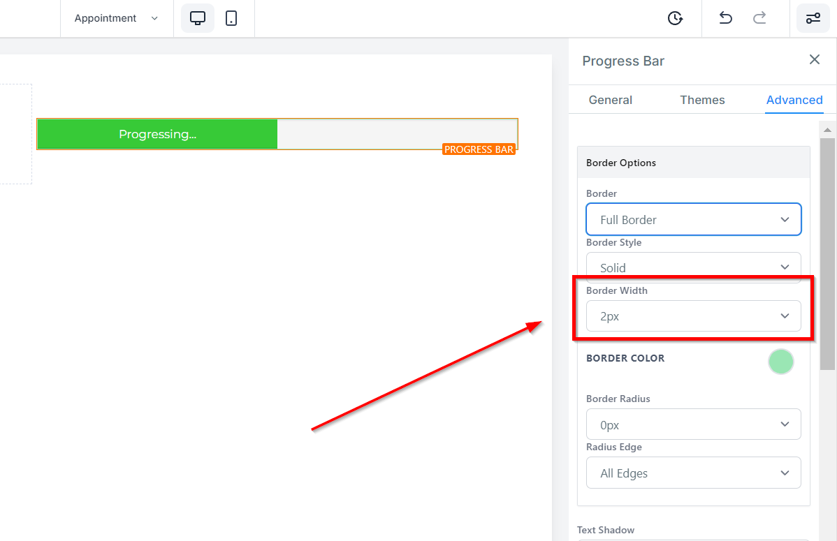
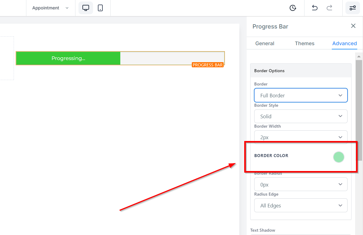
Color Choose a color for your borderline from the given color options, or type in a custom color code in the given field.
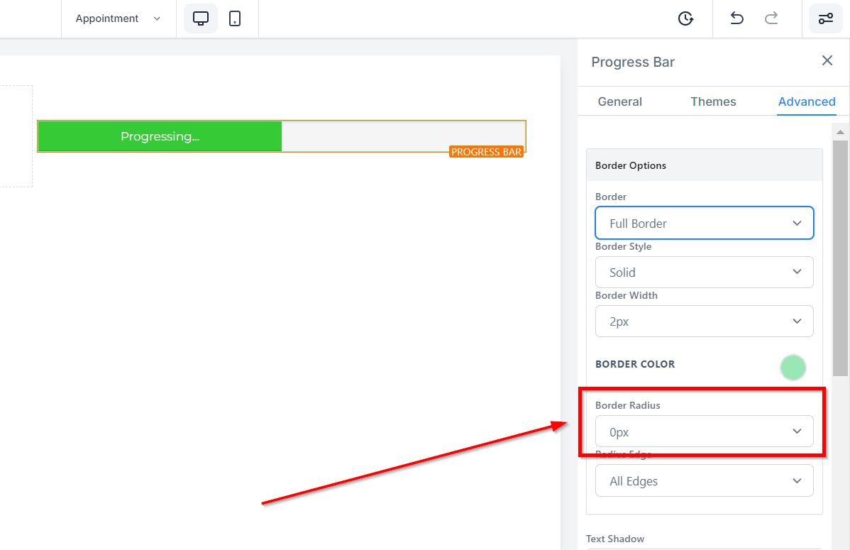
Radius
If you don't want your border to have sharp corners, you can select from the radius options to make it more rounded.
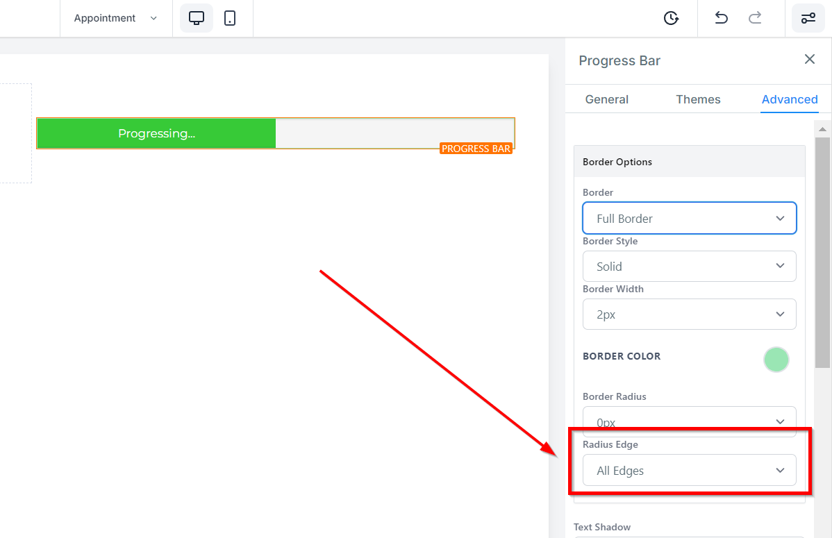
Radius Edge Additionally, you can choose which edge to adjust by selecting from the options of All edges, Top only, or bottom only.
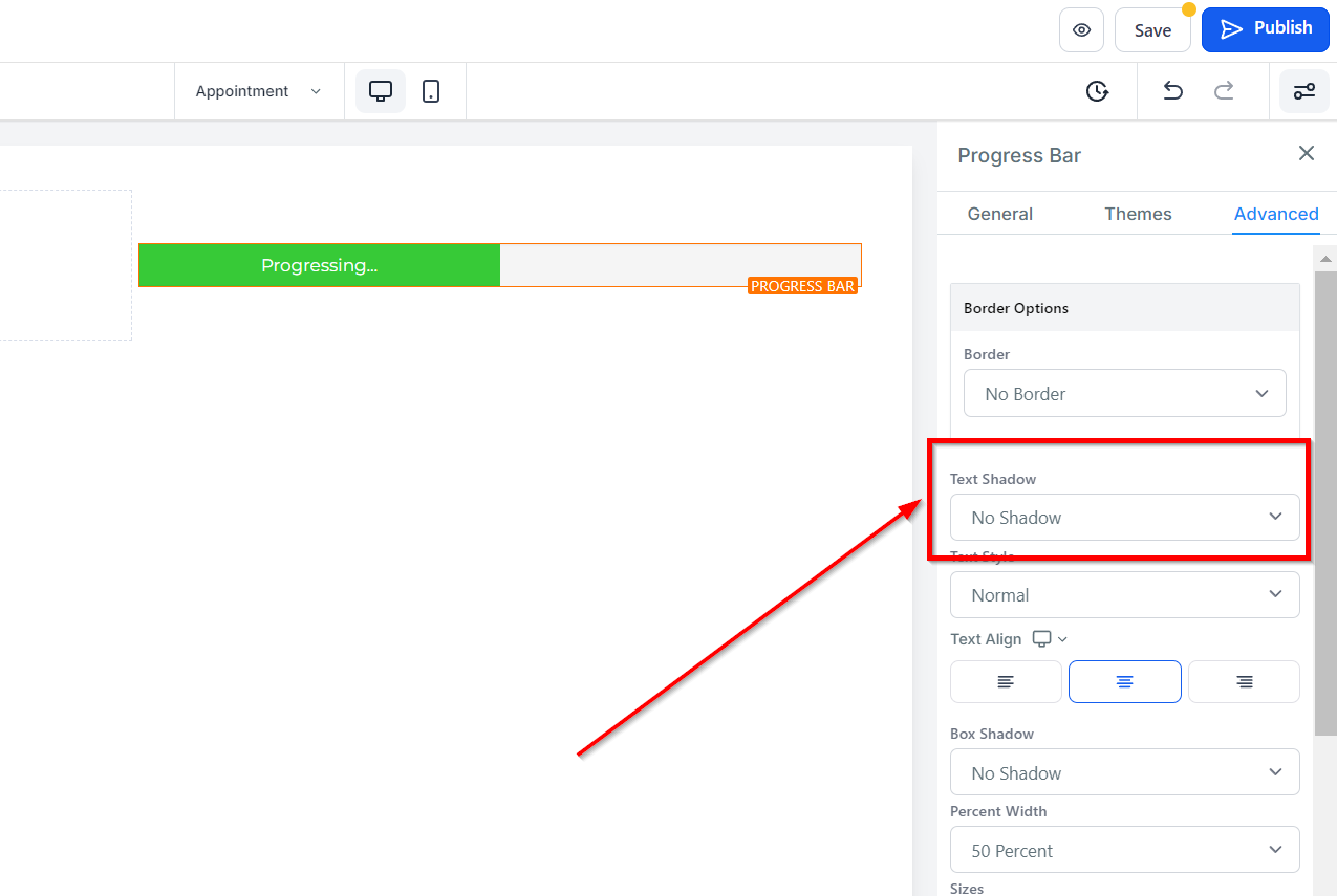
Text Shadow
In the Text Shadow option, you can add a shadow effect to your text/content. You can select the strength of the shadow, ranging from no shadow to light fade, mid-shadow, and strong shadow.
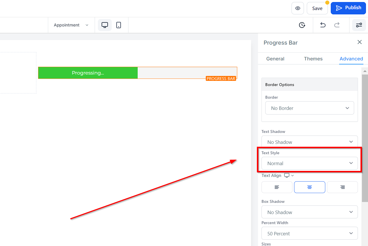
Text Style
Under Text Style, you can choose the style for your font, either bold, italic, or bold and italic.
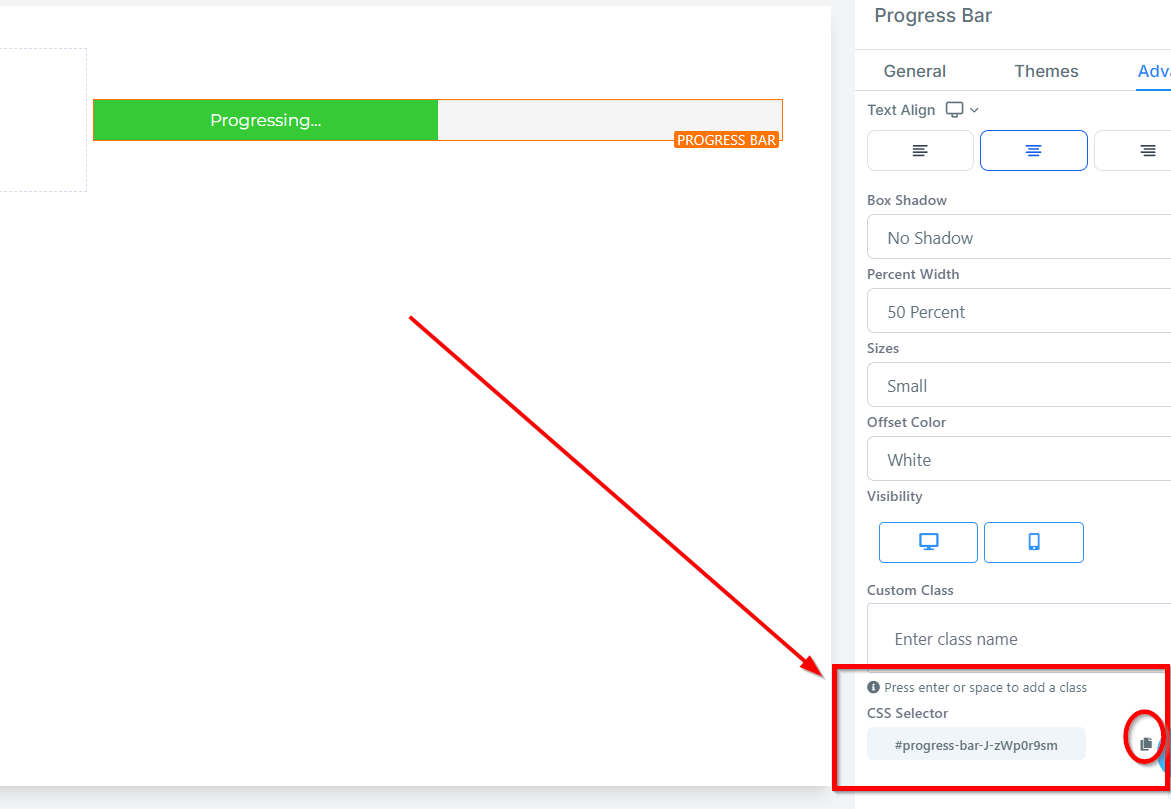
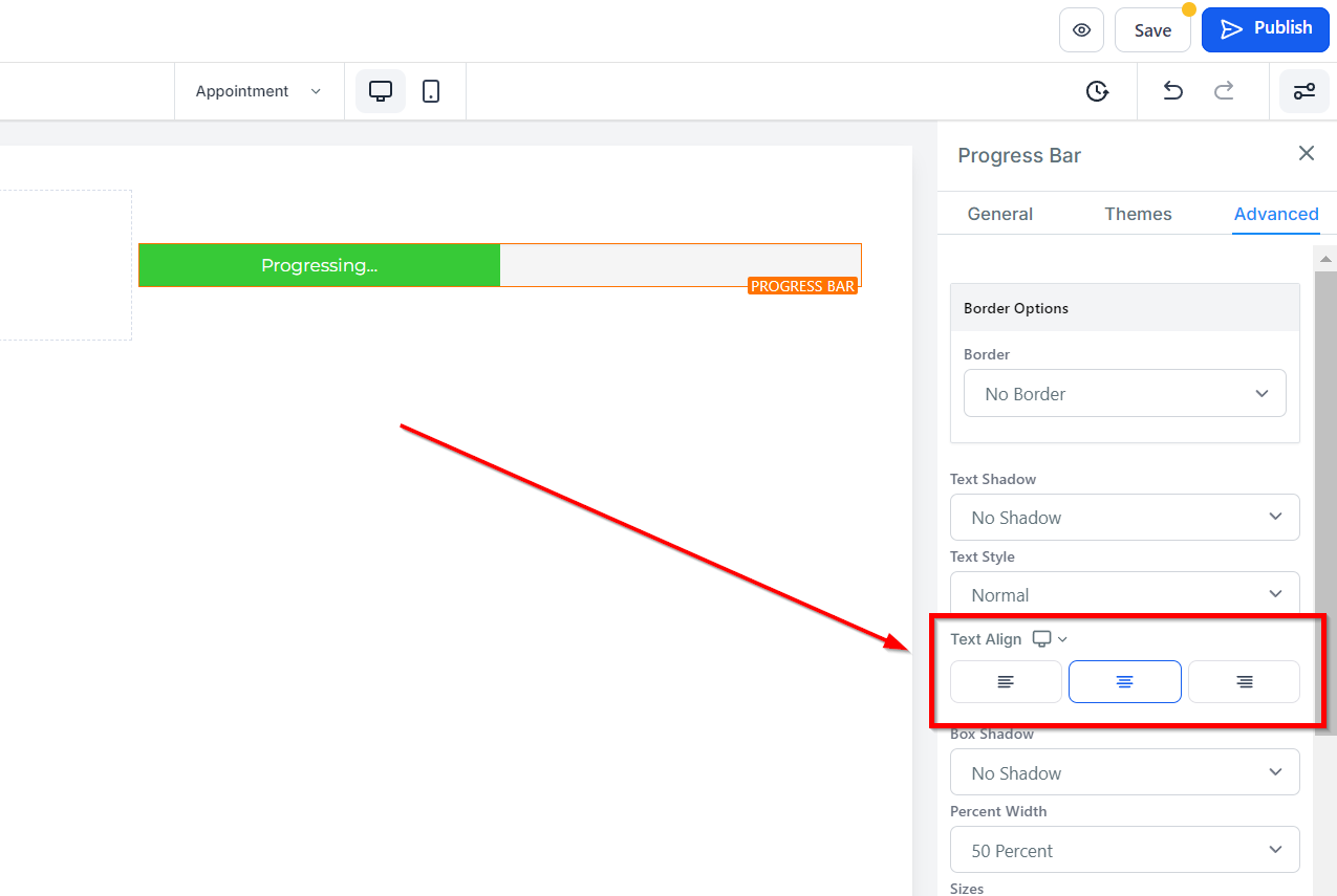
Text Align
Text Align gives you the option to move your text in different positions such as left, center, right, or as justified.
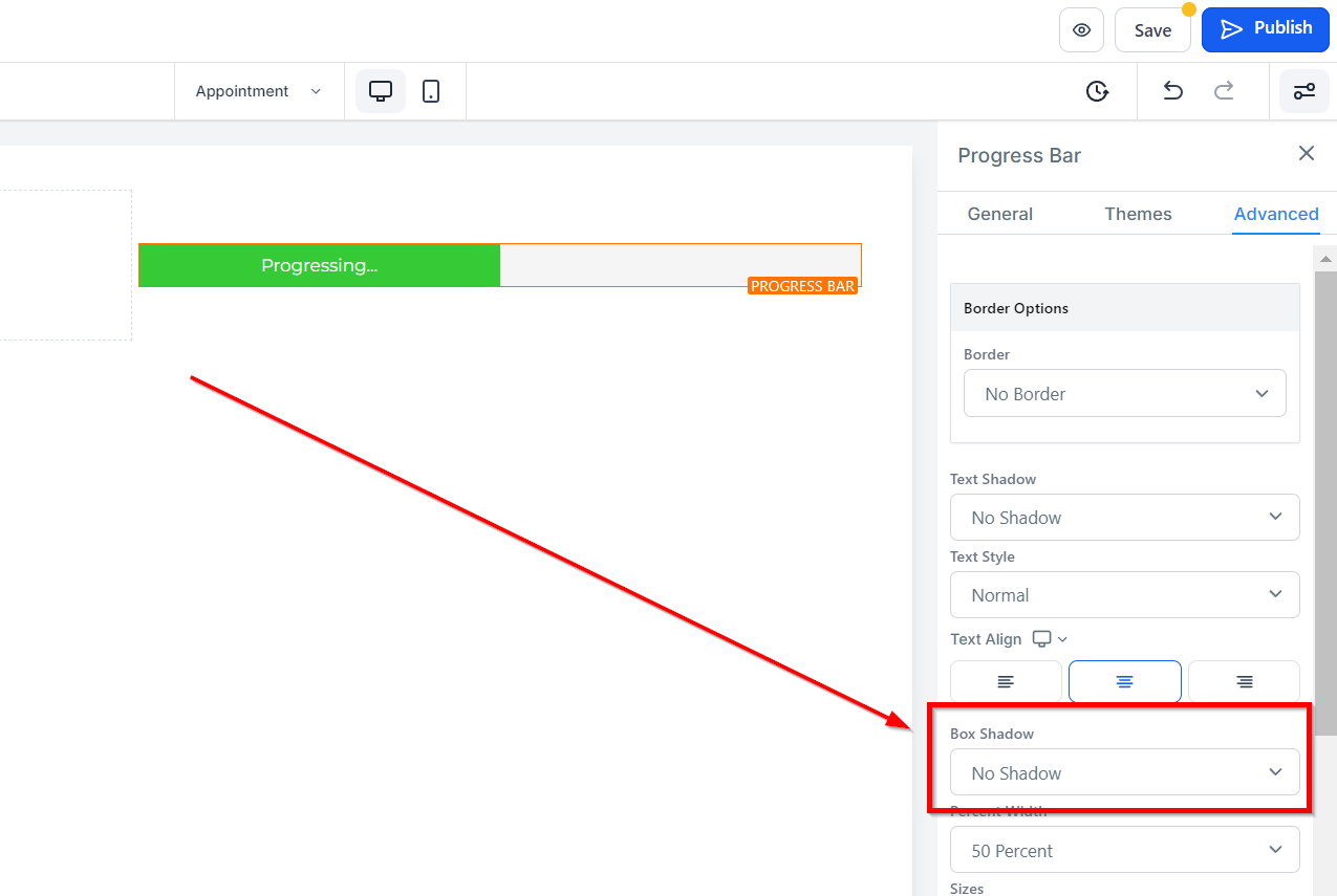
Box Shadow
If you would like to add a box shadow around your progress bar, select the dropdown and choose from your options of drop shadow or inner shadow. You will see various intensities of shadows, so play around with them to see which one fits your needs the best.
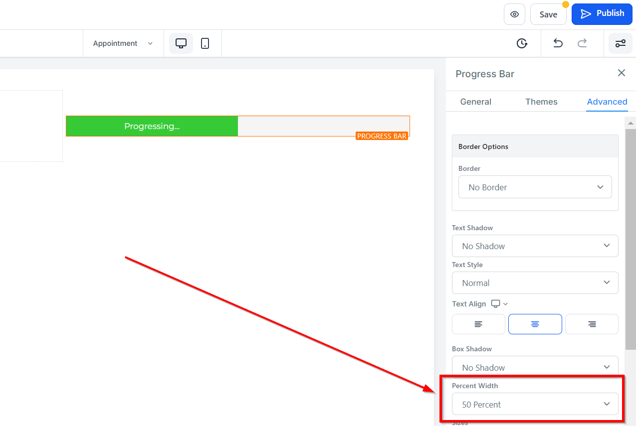
Percent Width
With the Percent Width dropdown, you can choose how wide you would like your progress bar to be within the element box. You can choose from 0 percent up to 100 percent.
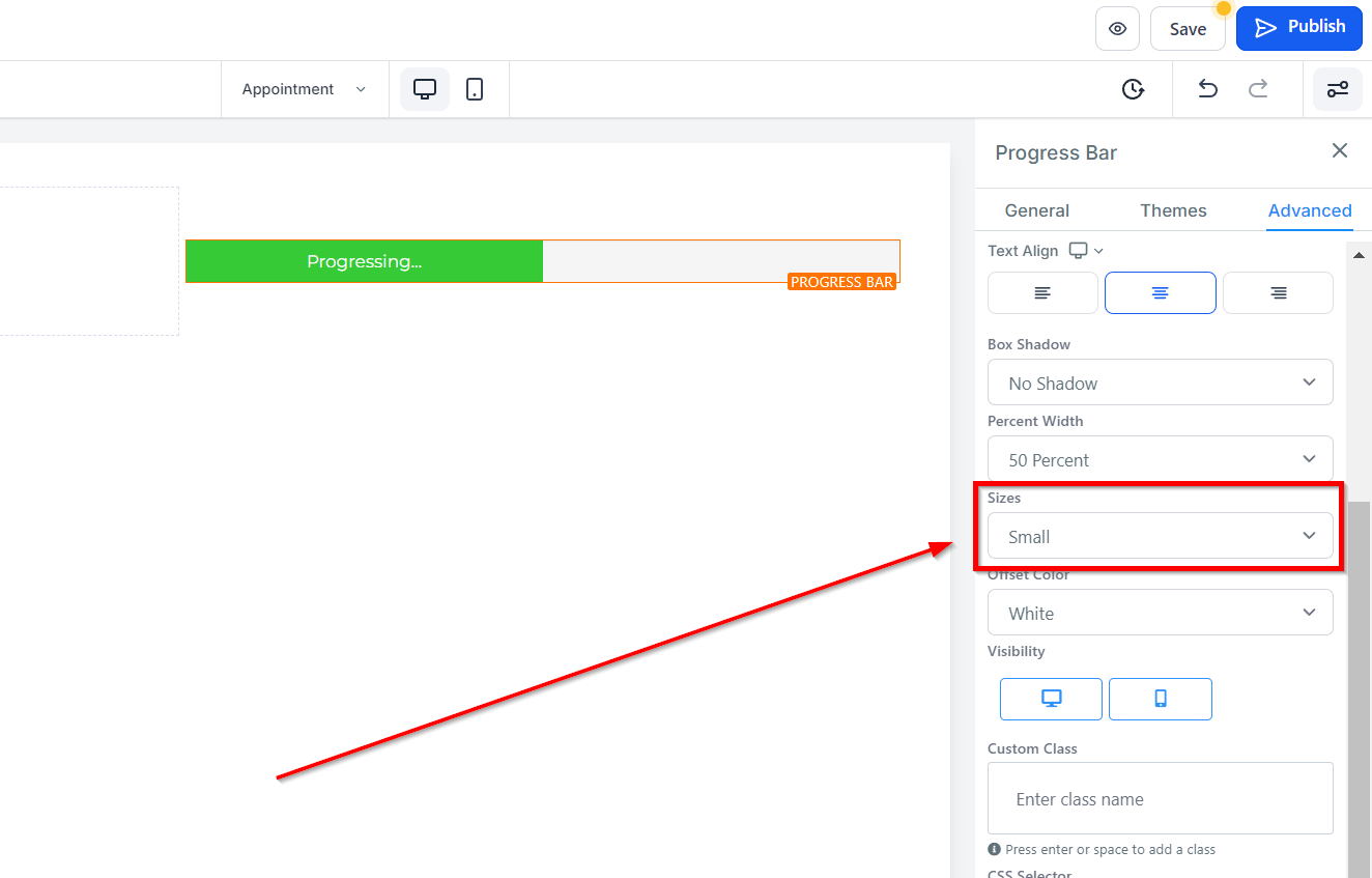
Sizes
You can also select the height of your progress bar with the Sizes dropdown. Your options here are small, medium, and large.
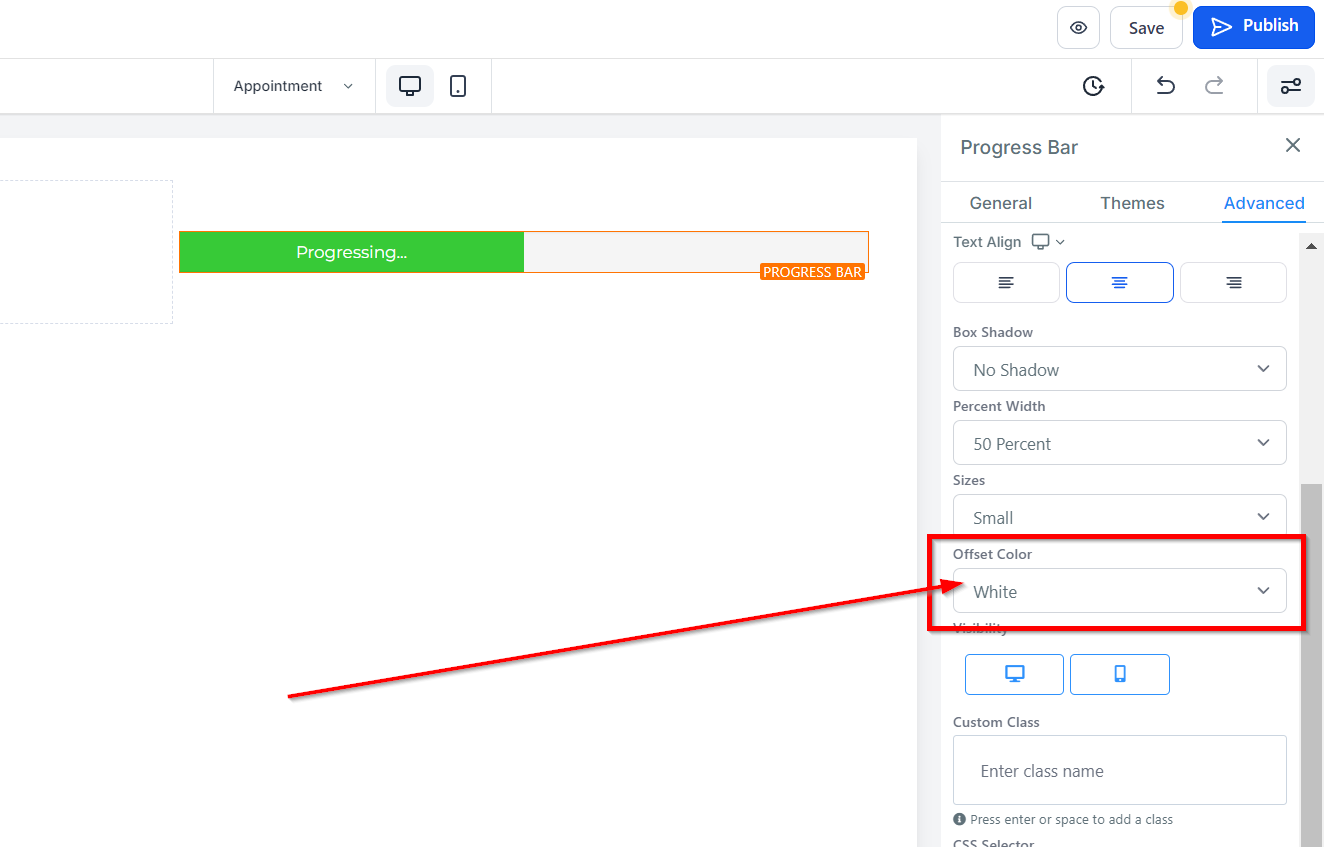
Offset Color
If you would like to set the offset color of your progress bar, which fills in the remaining section of your element box (if you don’t have your progress bar set at 100%), you can choose from the options in the dropdown menu. Here you can select the offset color to be white, transparent white, black, or transparent black.
Visibility
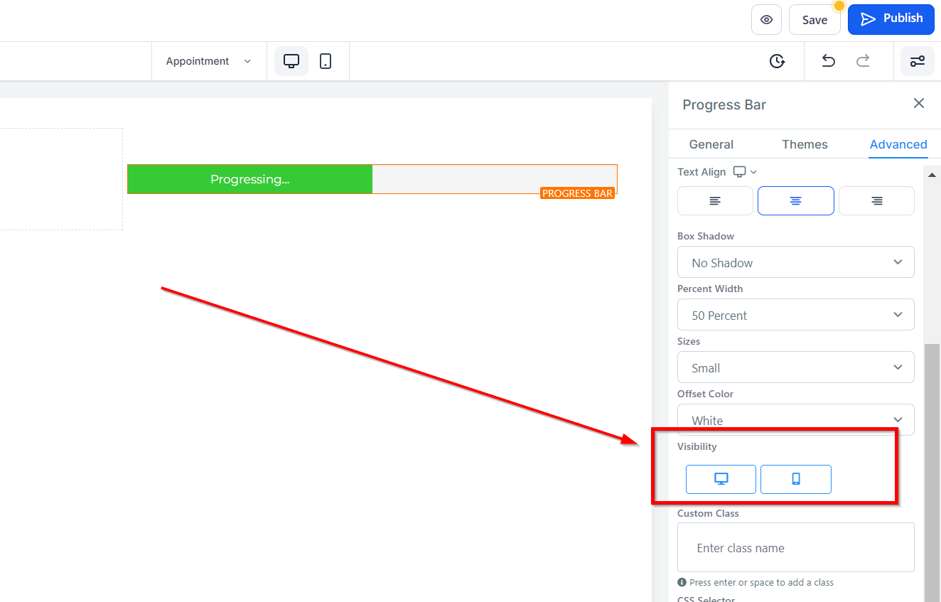
Under the Visibility option, you can choose whether to make a particular edit option visible on mobile devices, desktops, or both by clicking on the corresponding icon.
Custom Class
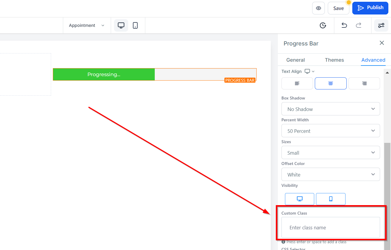
For creating custom classes, you can use the Custom Class space provided.
CSS Selector
If you need to copy the Custom CSS, just click on the "Copy" icon on the right side of the reference code.